APPROACH
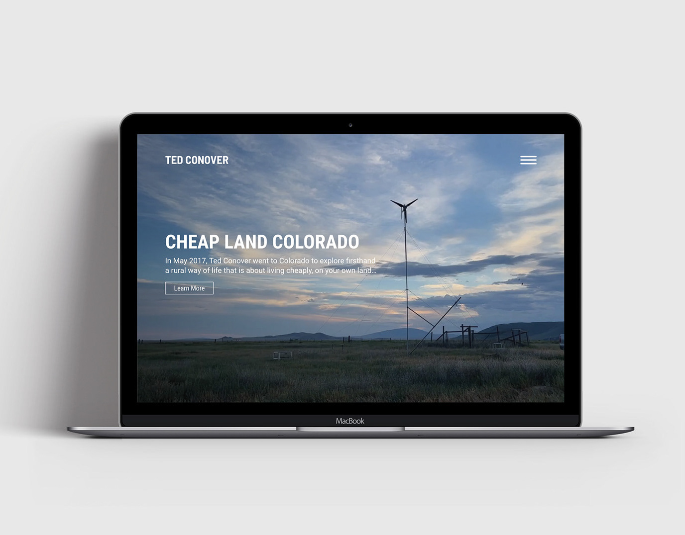
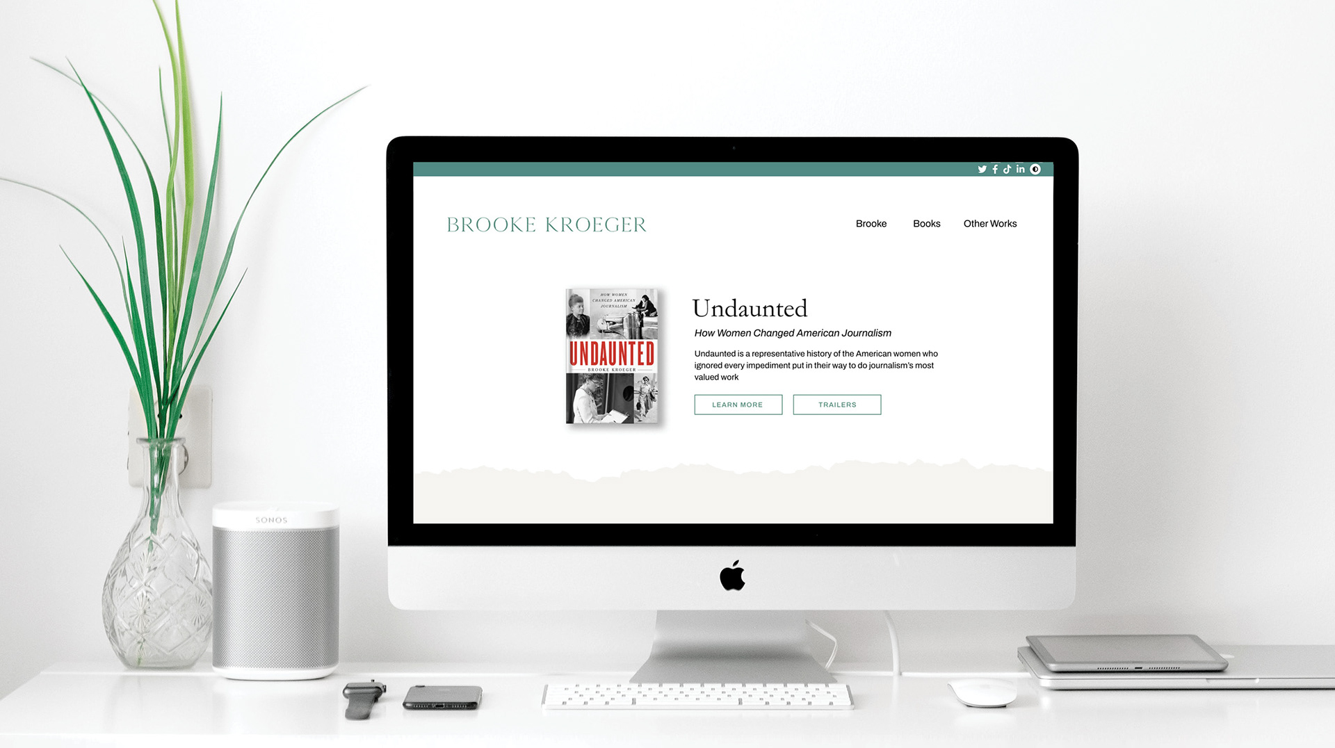
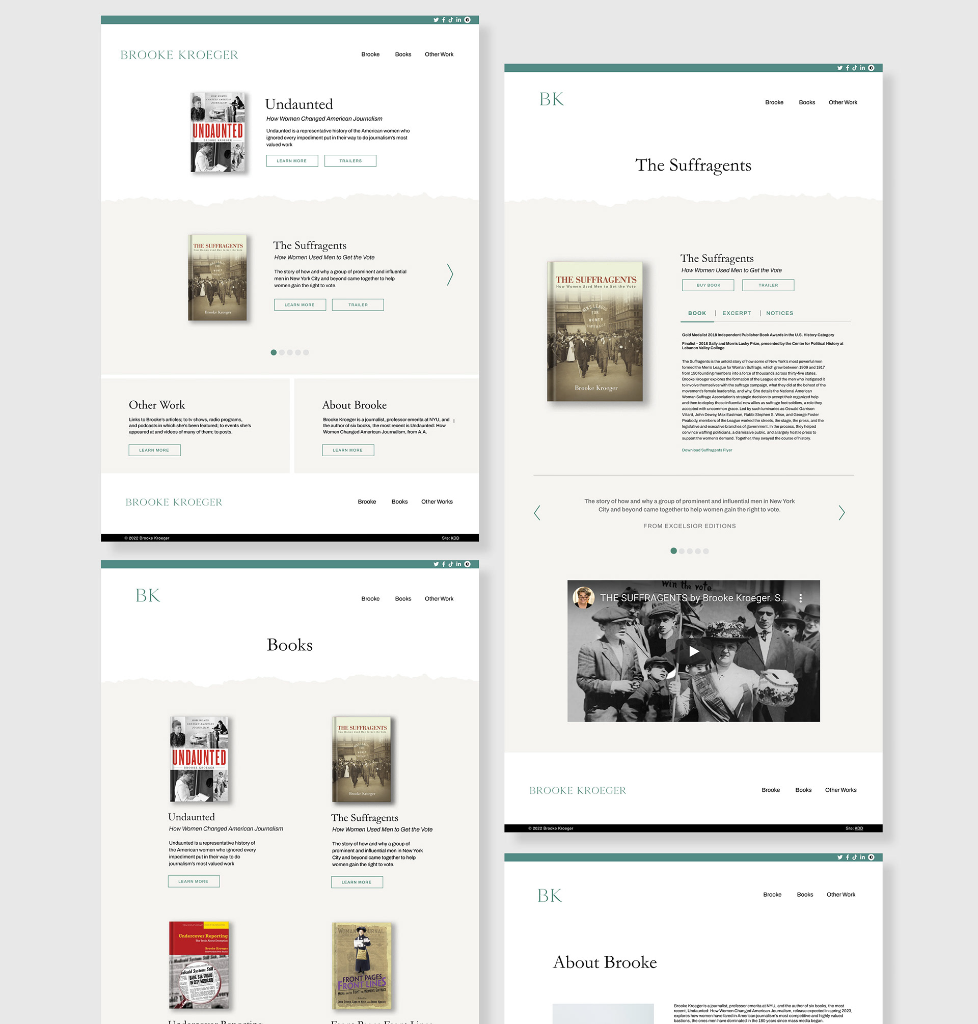
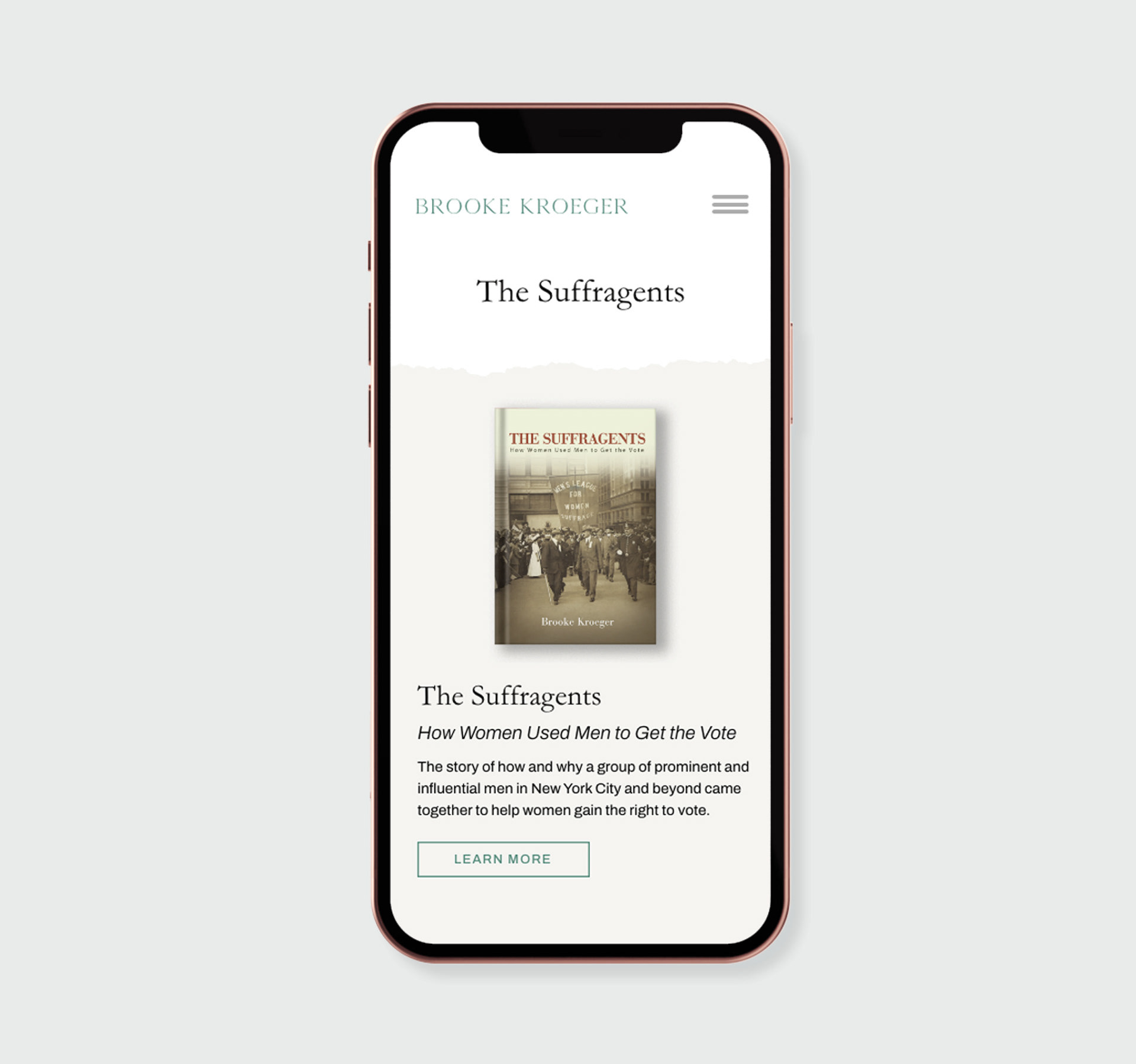
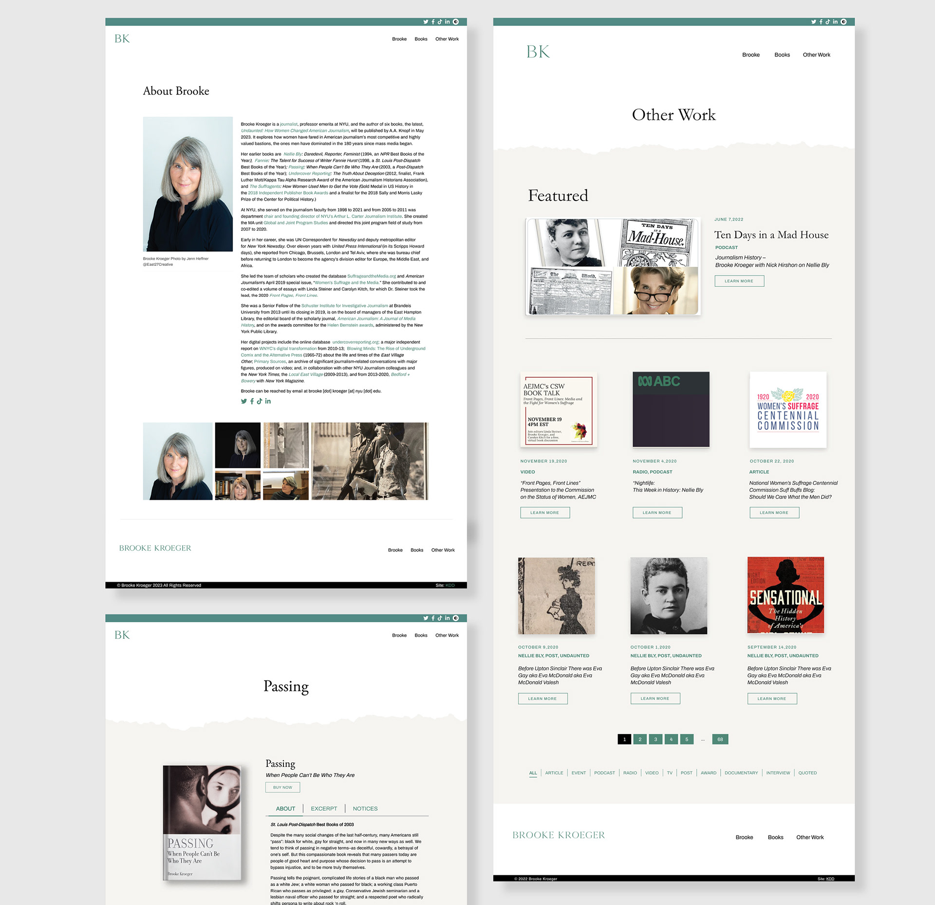
Initially, I began designing this site in Adobe XD, where I started with the home page design. The hero area became a focal area for her new book, while the slider under the hero area was a showcase of her other written works. Wanting to create a unique way to create breaks in the space and content, a ragged paper edge was used to separate the hero space and the content on the page. This texture paired with the grayish background was meant to be reminiscent of newspapers to play on the ideas central to the authors books; journalism. The neutral color palette was also established to allow the books to become the focal point on the page due contrasting bold colors and type. From the home page, I branched off into designing the books page and other works page which would present organizational challenges.
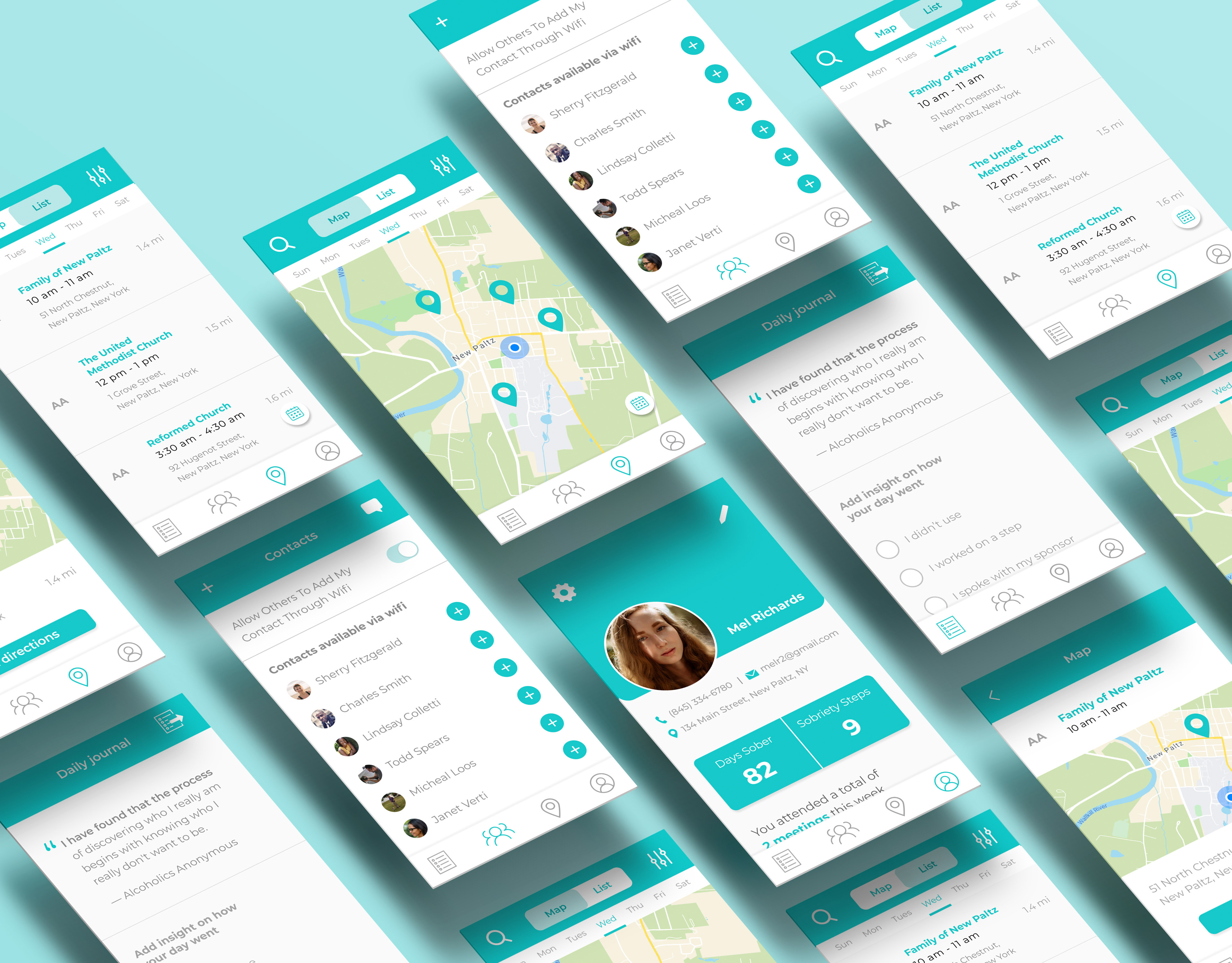
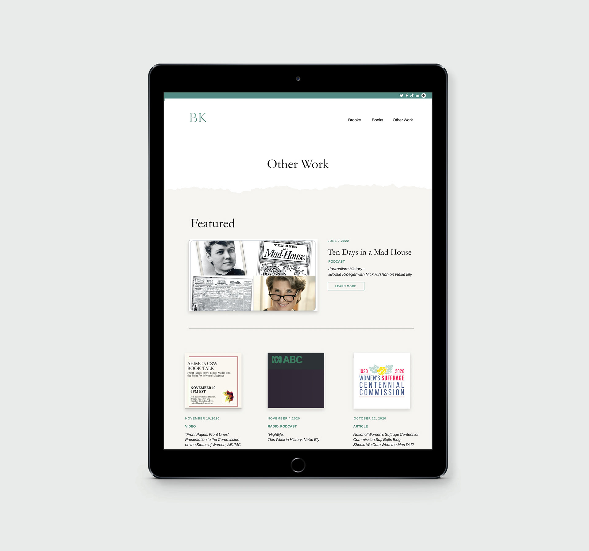
The client’s old site was cluttered, had large paragraphs that were difficult to read and the site was difficult to navigate. There were two main challenges regarding content within this site in order to allow the content to shine. The first challenge was addressing the organization of content for each book. The utilization of tabs for each of the books played a key part in creating digestible chunks of information of users. The use of tabs to separate details regarding the premise of the book, excerpts and notices/reviews was a crucial part or organizing content for each book. Secondly, the organization of the blog also needed to be carefully planned out. Since this client was consistently updating her blog with appearances, podcasts, articles and other content, a filter system was implemented to create a categories system for users. A featured blog area was also created I order for the client to highlight her literary accomplishments. While designing these features, it was important that these features be easily editable by the client for the future on the backend.
This project was created and completed while employed as a Graphic Designer at KDD Marketing.