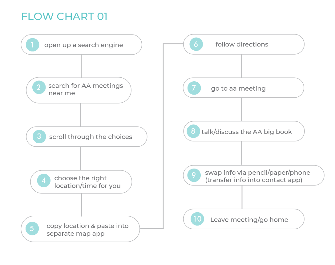
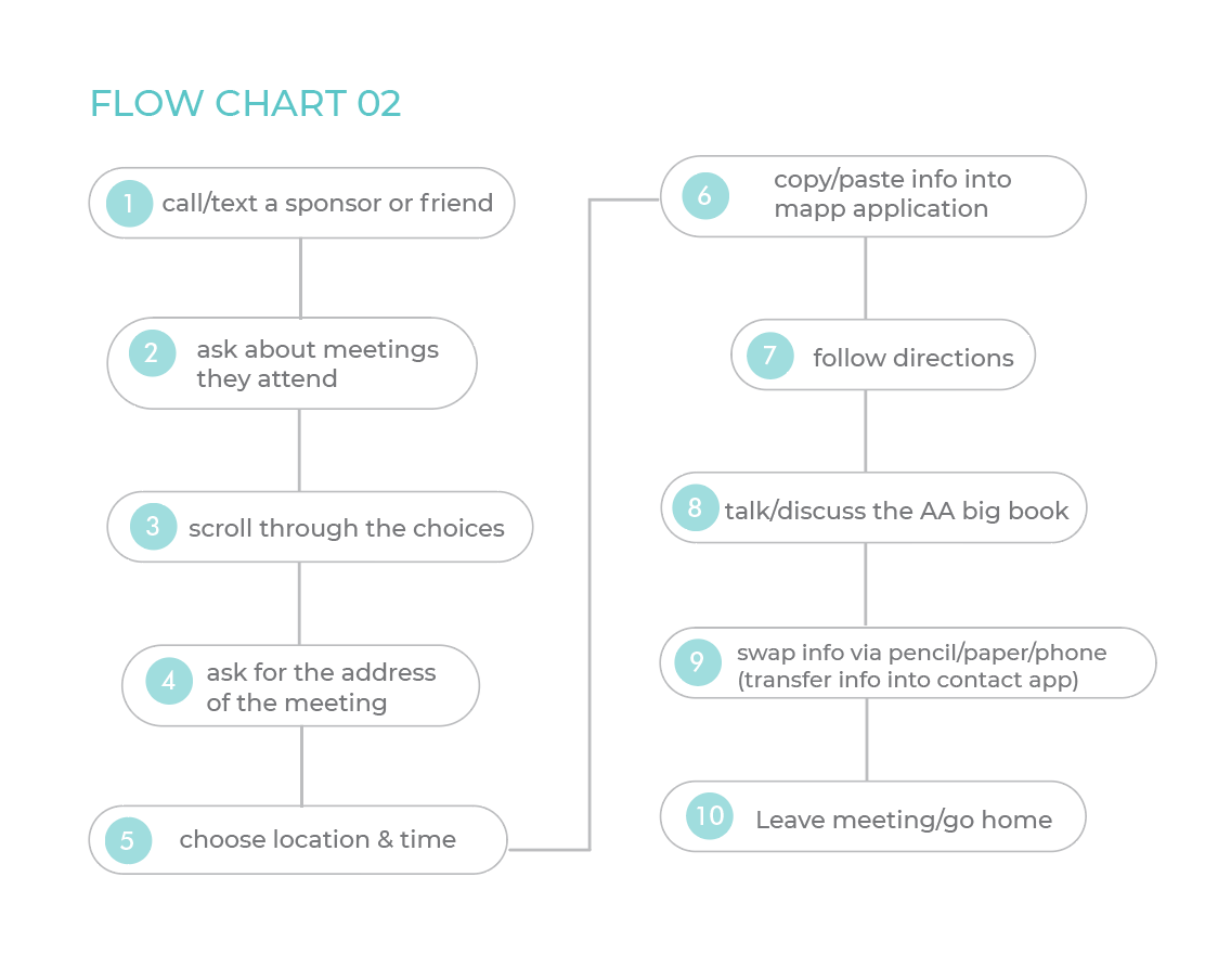
Process
First, two flow charts were created to show the current processes for individuals in Alcoholics Anonymous meetings. These flow charts serve to show where the buffers of sharing information at meetings exist and guided design solutions such as automatic meeting attendance tracker & the ability for users to add contacts directly through shared wifi.
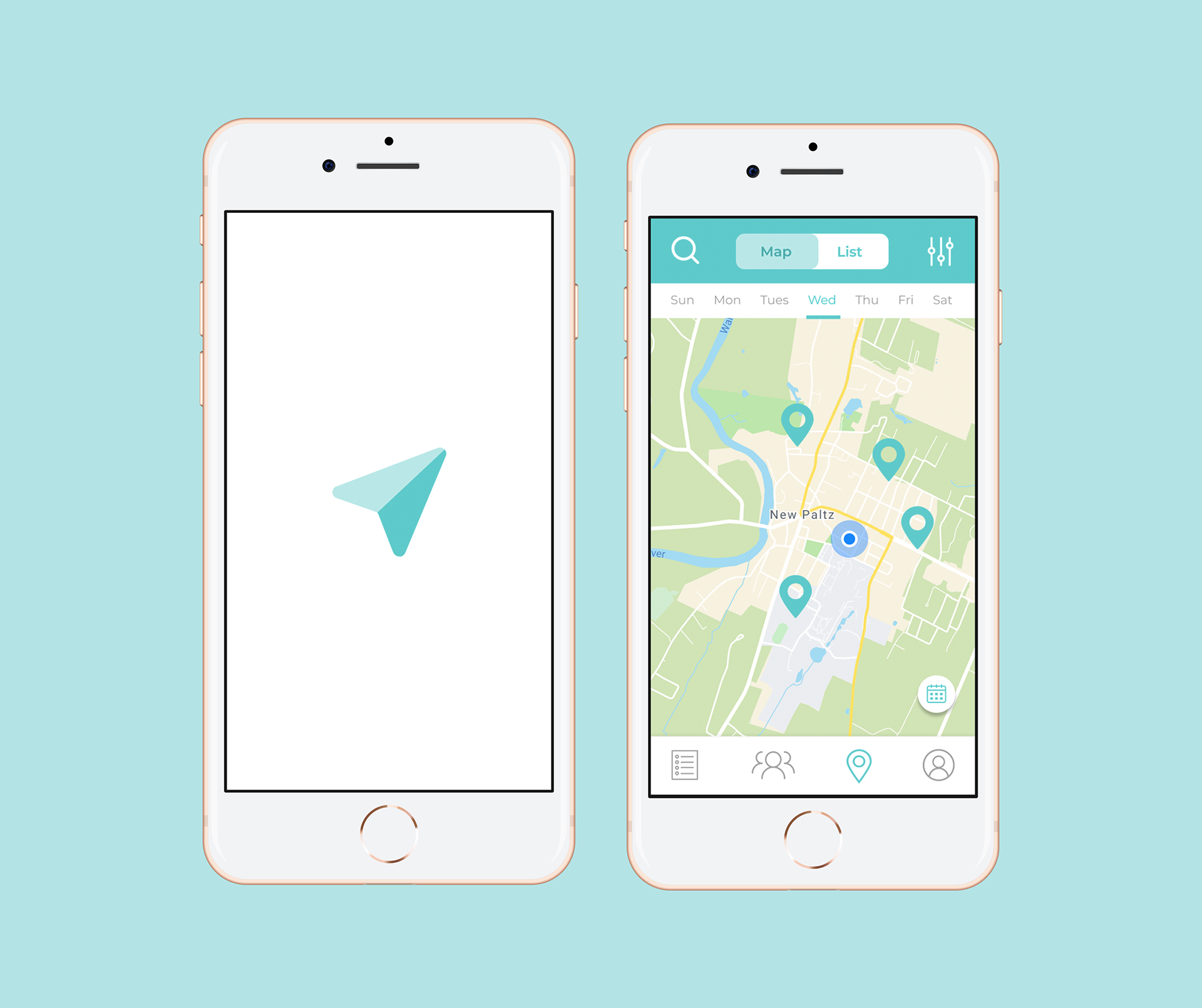
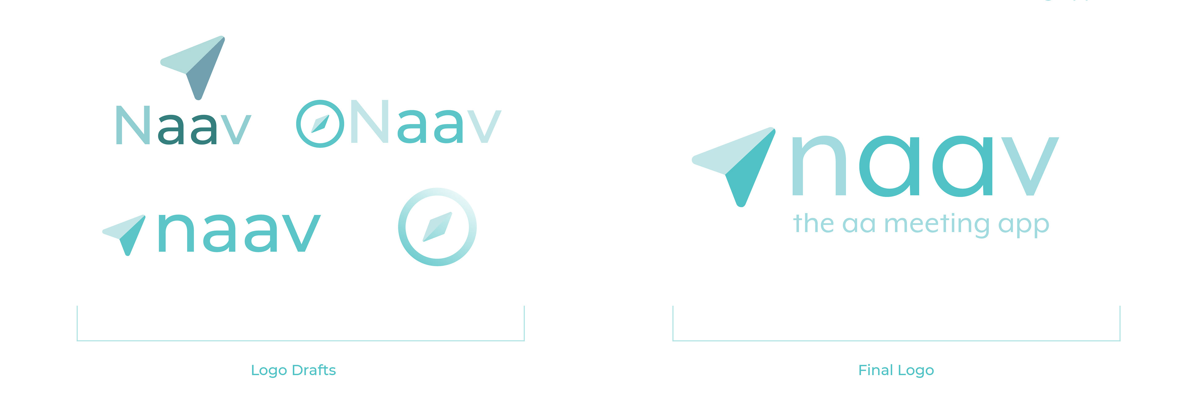
Branding of Naav
The name Naav plays off of the idea of navigation while the "aa" in the name reflects its purpose of navigating users to Alcoholics Anonymous meetings. The teal color palette paired with light greys signifies hope and serenity. The arrow signifies the mapping of directions to get to nearby meetings, but also symbolizes the path of sobriety. In other words, Naav is the A.A. meeting app that not only helps people navigate to A.A. meetings, but assists in the journey of sobriety.
Wireframes
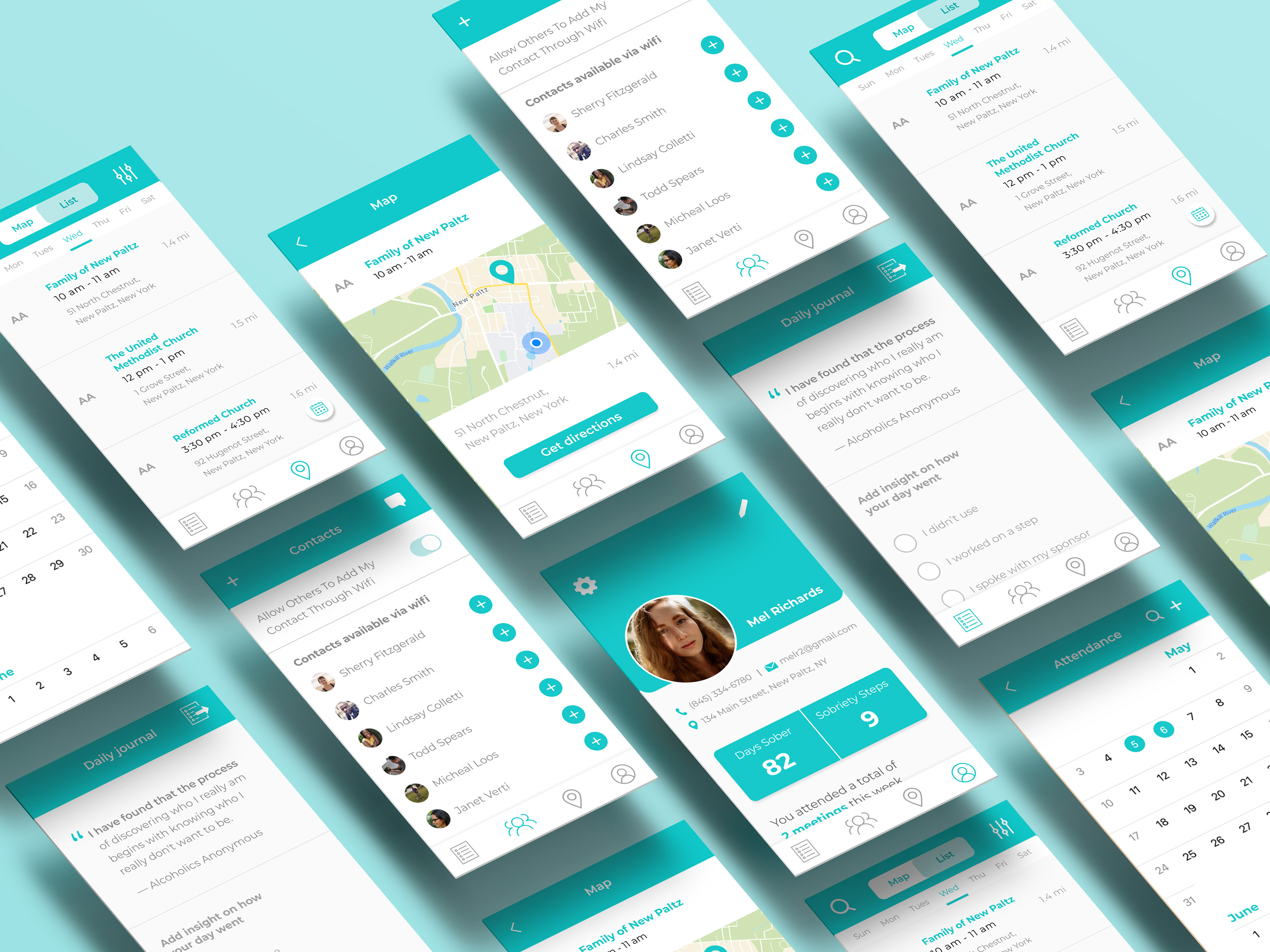
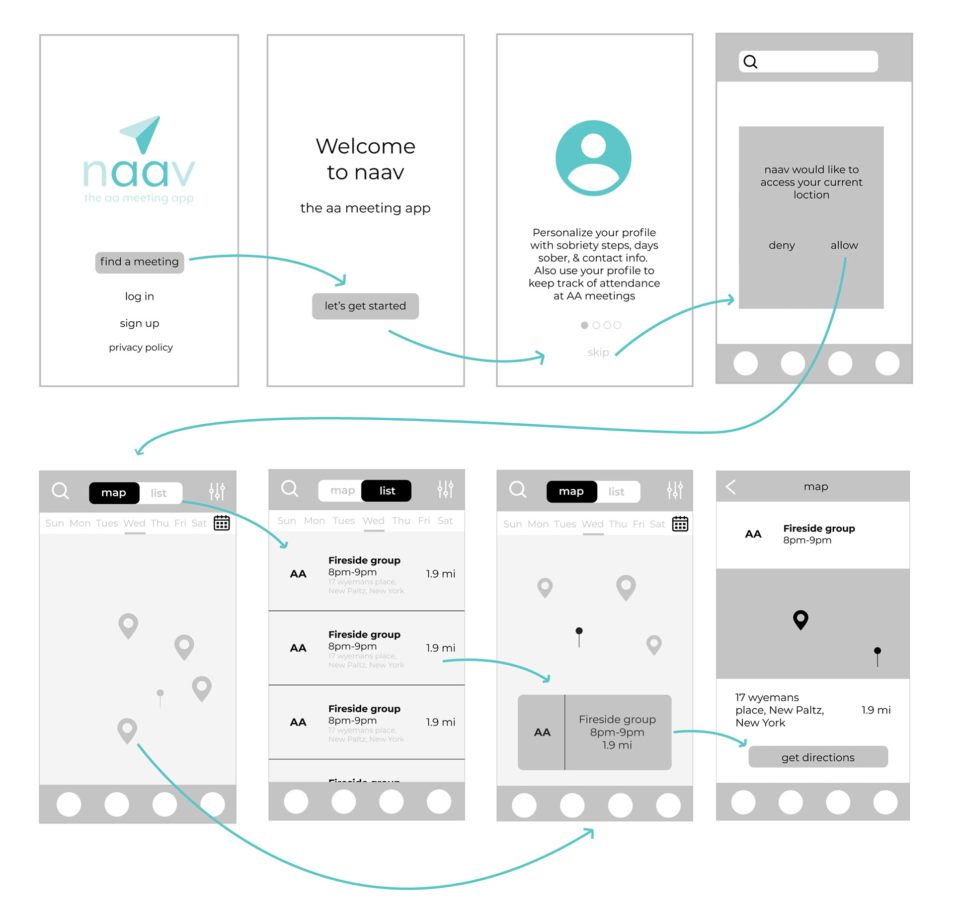
Building wireframes was an important part of the process for creating the Naav app because it showed the overall user flow of the app along with moments were the buffer would be solved. This stage also elucidated which aspects needed to be more involved and detailed to create the best user experience possible. Over 120 screens were designed for the final prototype.
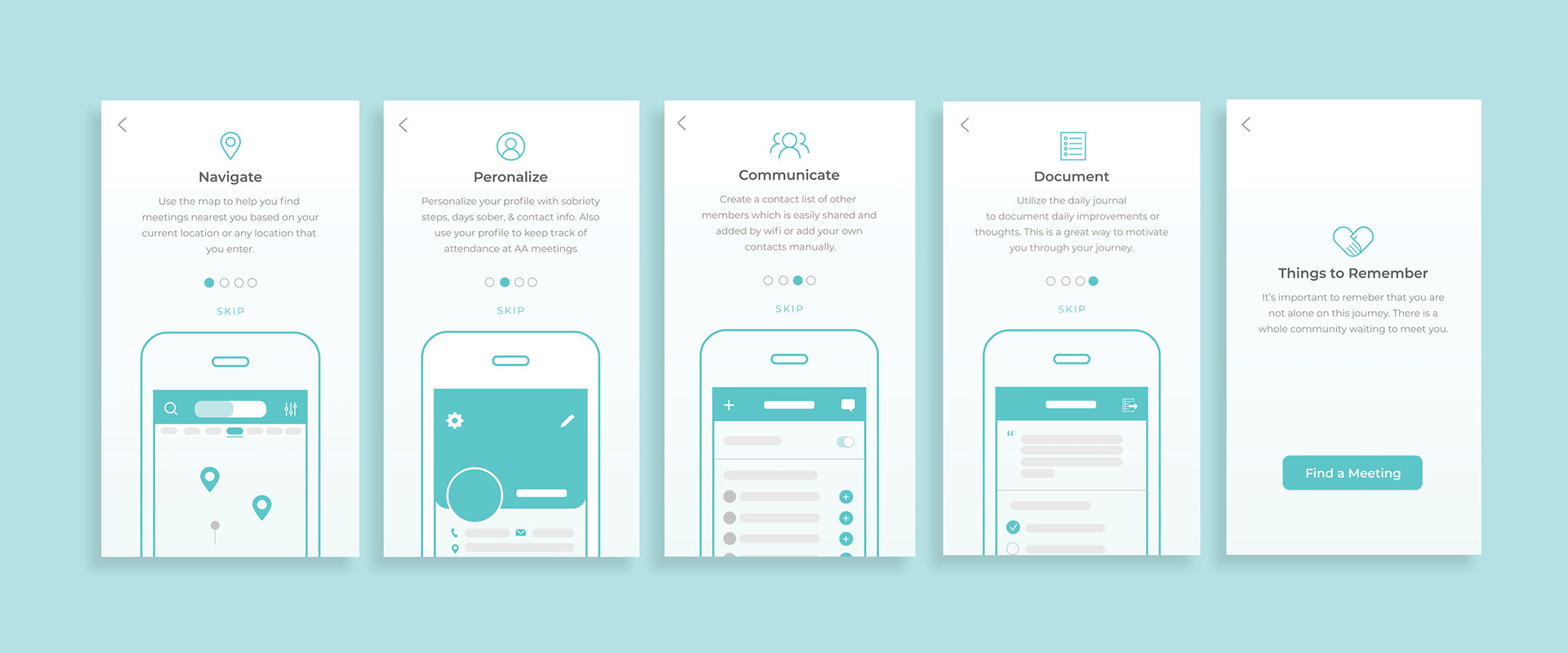
Final User Interface Design
Once the screens were fleshed out and branding was solidified, screens for onboarding, the map, contacts, journal, and profile were refined.